# 4WP Responsive
Responsive controls for core Gutenberg blocks with per-breakpoint spacing, visibility, font-size, and alignment support. Designed to be theme.json-first and editor-friendly.
## Documentation
– Plugin page: https://4wp.dev/plugin/4wp-responsive/
– GitRepository: https://github.com/4wpdev/4wp-responsive
## What it does today
– Responsive spacing per breakpoint (Padding/Margin: top/right/bottom/left).
– Responsive visibility per breakpoint (Hide / Show only).
– Responsive font-size per breakpoint for blocks that support typography.
– Responsive text alignment per breakpoint (left/center/right/justify).
– Works with core blocks (e.g. Heading, Paragraph, Group, List) and any block that supports the same features.
– Uses utility CSS classes + CSS variables (no frontend JS).
– Editor preview stays in sync with the selected device mode.
## Advantages
– Theme.json-first: reads spacing and font-size presets from the active theme.
– Works with standard blocks (no custom block requirement).
– Minimal markup changes: classes + CSS variables only.
– Safe fallback: content stays intact if the plugin is deactivated.
– Single generated CSS file, cached with a hash.
## How it works
– **Presets** (from `theme.json`) are applied via utility classes like:
– `has-forwp-padding-top-mobile-40`
– `has-forwp-font-size-desktop-large`
– `has-forwp-text-align-mobile-center`
– **Custom values** (e.g. 150 / 150px / 2rem) are applied via:
– class `has-forwp-*-custom`
– CSS variable on the block, e.g. `–forwp-padding-top-mobile: 150px;`
– this keeps output clean while allowing arbitrary values
## Editor UI
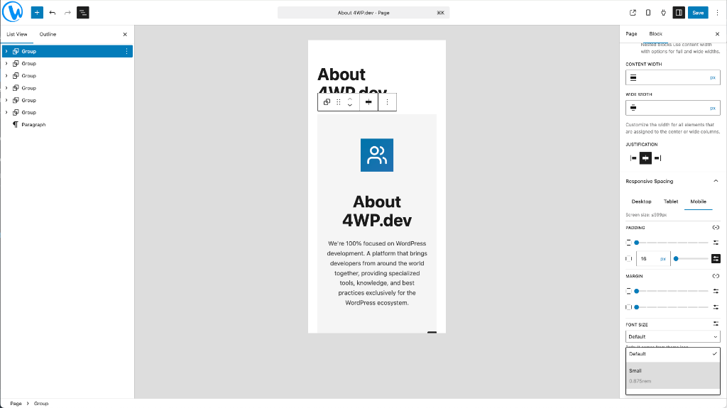
You will find **Responsive Spacing** in the block inspector sidebar:
– Tabs: Desktop / Tablet / Mobile
– Sections: Padding, Margin, Font Size, Alignment, Visibility
– Current screen size is shown per tab
– Hidden blocks are dimmed in the editor instead of fully removed
## Settings
`Settings → 4WP Responsive`
### Breakpoints
Displayed in a table with the active source:
– `theme.json` (`settings.custom.breakpoints`), if present
– Plugin settings, only when `theme.json` has no breakpoints
– Default values if neither is available
If the theme defines breakpoints, custom fields are disabled to avoid conflicts.
### CSS storage path
Generated CSS is stored in `wp-content/uploads/4wp-responsive/` by default.
You can override the storage path with an absolute path if your architecture requires it.
## Requirements
– WordPress 6.0+
– PHP 7.4+
– A theme with `theme.json` is recommended (for presets).
## Notes
– The plugin respects theme.json presets for spacing and font sizes.
– Custom values are supported, but only through CSS variables (no inline padding/margin).